Input Widgets
One of the features we are working towards in the 1.0 release, is a simplified way of adding, setting & getting widgets.
Each widget will have a single function that supports all three actions.
If you combine this with the context manager feature, this becomes possible:
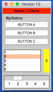
from appJar import gui

def press(btnName):
    app.popUp("INFO", "You pressed " + btnName)

def update(value):
    if value == "list": app.slider("slider", app.listbox(value)[0])
    elif value == "slider": app.listbox("list", app.slider(value))
    app.label("display", app.listbox("list")[0])

with gui("Version 1.0", bg="teal") as app:
    app.label("Version 1.0 Demo", colspan=2, bg="red")
    with app.labelFrame("Big Buttons", colspan=2, sticky="news", expand="both"):
        app.button("BUTTON A", press)
        app.button("BUTTON B", press)
        app.button("BUTTON C", press)
    app.listbox("list", [1, 2, 3, 4, 5], rows=5, selected=0, submit=update)
    app.label("display", "1", row=2, column=1, bg="yellow", sticky="news")
    app.slider("slider", colspan=2, range=(1,5), change=update, interval=1)
Operation
As demonstrated above, each widget now has a single function - the name of the widget.
Call this function passing one or both of the key parameters, to determine what should happen:
app.label("title", "text")      # ADD a label if the title is new
app.label("title", "text_2")    # SET a label if the title already exists
print(app.label("title"))       # GET a label if no widget is being added or set
Key Parameters
The two key parameters are:
| Parameter | Data type | Description |
|---|---|---|
| title | string | A unique identifier for that widget type. |
| value | string | Any relevant information for the widget. |
The logic is as follows:
- If
titledoesn't exist - ADD the widget, using thevalue, ortitleif novalueis specified. - If
titlealready exists and avalueis specified - SET the widget (either the values or state). - If
titlealready exists and avalueis not specified - GET the widget.
Positional Parameters
When adding a widget, it is positioned in the first column of a new row.
If you want to change this, you can specify where it should go, either by naming the paramters:
app.label("title", "text", row=2, column=4, rowspan=3) # ADD a label
Or by passing them as a tuple:
app.label("Main Title", pos=(1, 0))     # ADD a label in row 1, column 0
app.label("Sub Title", pos=(2, 0, 2))   # ADD a label in row 2, column 0, spanning 2 columns
| Parameter | Data type | Default | Description |
|---|---|---|---|
| row | integer | <next row> | The grid row to place the widget in. |
| column | integer | 0 | The grid column to place the widget in. |
| rowspan | integer | 1 | The number of grid rows to stretch the widget across. |
| colspan | integer | 1 | The number of grid columns to stretch the widget across. |
| pos | list/tuple | () | Position parameters for the widget, in the order: row, column, colspan, rowspan |
GUI Parameters
There are two GUI parameters which affect how widgets are displayed sticky and stretch.
These can be modified when adding a widget, just bear in mind they are GUI settings, and will affect all future widgets in the current container.
app.label("Title", sticky="", stretch="none")
app.label("SubTitle", sticky="ns", stretch="row")
| Parameter | Data type | Default | Description |
|---|---|---|---|
| sticky | string | <varies> | Describes which sides the widget will stick to, one or more of: n, e, w, s in a single string. |
| stretch | string | <varies> | Describes how the widget will stretch to fill the row/column: none, row, column or all. |
Event Parameters
Most of the widgets also have some support for events (see the events page for more information).
submit & change will pass the name of the widget to the function, drop will pass the data to the function:
NB. the parameter should only be the name of the function, don't include any brackets.
def update(name):
    if name == "size":
        updateSize()
    elif name == "toppings":
        updateToppings()

app.listbox("size", ["small", "medium", "large"], change=update)
app.listbox("toppings", ["corn", "cheese", "peppers"], change=update)
app.image("img1", "placeholder.gif", drop=True)
| Parameter | Data type | Default | Description |
|---|---|---|---|
| change | function | None | A function to call when the widget is changed. |
| callFunction | boolean | True | Set this to False, when setting the widget to stop the change function form being called. |
| submit | function | None | A function to call when the widget is submitted. |
| over | function (list) | None | A function to call when the mouse enters the widget, with an optional second function to call when the mouse leaves. |
| drop | boolean/function | None | Update the widget with dropped data if True, otherwise call the function. |
| drag | function (list) | None | A function to call call when the widget is dragged, with an optional second function to call when the widget is dropped. |
Other Parameters
There are some other parameter that can be set on widgets.
| Parameter | Data type | Default | Description |
|---|---|---|---|
| label | boolean/string | False | Adds a Label before the widget (only some input widgets), either the label's title or the the text of this parameter. |
| right | string | None | Specify a premade right-click menu to link to the widget. |
| font | integer/dict | None | Pass either a font size, or a dictionary of font properties to use for this widget's font. |
| focus | boolean | False | Give keyboard focus to the widget. |
| tip | string | None | Sets text to show in a mouse-over tooltip. |
Entry
An interactive widget, for capturing user input in the GUI.
.entry(title, value=None)
Avalueis not required, but if provided will populate the entry.
Entries can receive achangeparameter, and can link asubmitparameter to pressing.
Entries can receive adropparameter, allowing them to receive drop events.
Entries can receive alabelparameter - boolean to use the label's title or text to display.
| Parameter | Data type | Default | Description |
|---|---|---|---|
| kind | string | standard |
One of: standard, file, directory, numeric, auto or validation. |
| secret | boolean | False | Configures the entry box to show stars instead of characters. |
| default | string | None | Sets default text to display in an empty entry. |
| rows | integer | 10 | If the kind is auto this will set the number of rows to show. |
| labBg | string | None | Special parameter to change the BG of the validation label in a validaiton entry. |
There are also some validation settings that can be applied:
| Parameter | Data type | Default | Description |
|---|---|---|---|
| limit | integer | None | Sets a maximum limit on the number of characters that can be entered. |
| case | string | None | Set to upper to force uppercase or lower to force lowercase. |
Text
An interactive widget, for capturing multi-line user input in the GUI.
.text(title, value=None)
Avalueis not required, but if provided will populate the text.
Text boxes can receive achangeparameter.
Text boxes can receive adropparameter, allowing them to receive drop events.
| Parameter | Data type | Default | Description |
|---|---|---|---|
| scroll | boolean | False | Will configure this as a scrollable text area. |
| tags | list | [] | A list of tags, where each tag contains a name and dictionary of values. |
| end | boolean | True | Whether to add the new text to the end (True) or beginning (False) |
| replace | boolean | False | Will replace any existing text in the text area when updating. |
Button
A clickable button for triggering events.
.button(title, value=None)
Thevalueshould be a function to call when the button is pressed.
| Parameter | Data type | Default | Description |
|---|---|---|---|
| image | string | None | A path to an image to show in the button. |
| icon | string | None | The name of an icon to show in the button. |
| label | string | None | Alternative text to display on the button. |
Link
A clickable hyperlink to trigger events or launch webpages.
.link(title, value=None)
Thevaluecan be set to a function to call when the link is clicked, or a valid URL to open in a browser.
Check
A checkbox style widget, that can be checked/unchecked.
.check(title, value=None)
Thevalueshould be True or False, indicating if the check starts selected or not.
Check boxes can receive achangeparameter.
Radio
Radio buttons are used in groups, only one of them can be checked.
By default, the first radio button added to a group will be selected.
.radio(title, value=None)
Thetitleis the radio button's group.
Thevalueis the text to display next to this radio button.
Radio buttons can receive achangeparameter, it will be linked to all radio buttons of the sametitle.
| Parameter | Data type | Default | Description |
|---|---|---|---|
| selected | boolean | False | Should this radio be selected? |
Option
When clicked, displays a drop-down of items, one of which can be selected.
Setting this widget won't change the values, but change which one is selected.
.option(title, value=None)
When adding, thevalueshould contain a list of items to display in the drop-down.
When setting, thevalueshould contain the item to select, unless a differetnmodeis set.
Options can receive achangeparameter.
Options can receive alabelparameter - boolean to use the label's title or text to display.
| Parameter | Data type | Default | Description |
|---|---|---|---|
| kind | string | standard |
Set this to ticks if you want tickable options. |
| selected | string/integer | None | Start with the specified item/position selected. |
| disabled | string | - | Sets the character used to indicate disabled menu options. |
| checked | boolean | True | When setting the widget, this determines what to do to the specified value. None will delete the value. |
| mode | string | select |
One of: select, change, rename. clear or delete - see below. |
Different modes can be used when setting the widget:
select - the default, the specified value will be selected.
clear - deselects all items in the option box.
change - the contents of the list will be replaced with a new listi, with an optional index.
rename - this will change the text of an item in the option box, to the newName.
* delete - this will delete the specified option from the option box.
Spin
Shows a single value, with arrows to scroll up or down, allowing the user to change the value.
Setting this widget won't change the values, but change which one is selected.
.spin(title, value=None, endValue=None)
If only thevalueis set, it should be a list of values to display in the spin box.
IfendValueis also set, then both parameters should be integers, and appJar will generate a range of whole numbers between the two values.
When setting, thevaluewill be selected.
Spin boxes can receive achangeparameter.
Spin boxes can receive alabelparameter - boolean to use the label's title or text to display.
| Parameter | Data type | Default | Description |
|---|---|---|---|
| endValue | integer | None | If specified, value & endValue should be integers, and will be used to generate a range. |
| selected | integer | 0 | The position of an item to select. |
| item | string | None | The name of an item to select. |
Listbox
Displays a list of items, one (or more than one) of which can be selected.
Setting this widget won't change the values, but change which one is selected.
.listbox(title, value=None)
When adding, thevalueshould contain a list of items to display in the listbox.
When setting, thevalueshould contain the item(s) to select.
Listboxes can receive achangeparameter.
Listboxes can receive adropparameter, allowing them to receive drop events.
| Parameter | Data type | Default | Description |
|---|---|---|---|
| rows | integer | None | Specifies how many rows to display in the listbox. |
| multi | boolean | False | Set the listbox to be multi-selectable. |
| group | boolean | False | Set the listbox to be part of a group. |
| selected | int | None | The position to select when the listbox is added. |
| mode | string | select |
One of: select, change, rename. clear or delete - see below. |
Different modes can be used when setting the widget:
select - default, select the specified item(s) or all
deselect - deselect the specified item(s), or all
toggle - toggle the specified item(s), or all
clear - clear any selected items
* rename - rename the specified item
replace - replace all items
add - add the specified item(s)
* delete - delete the specified item, or all
Slider
A draggable widget, where the user can select a number from a range.
.slider(title, value=None)
Thevalueis optional - it will set the starting position of the slider.
Sliders can receive achangeparameter.
Sliders can receive alabelparameter - boolean to use the label's title or text to display.
| Parameter | Data type | Default | Description |
|---|---|---|---|
| direction | string | horizontal |
Set the direction of the slider: vertical or horizontal. |
| show | boolean | False | Show the slider's value above the slider. |
| increment | integer | 10 | Configures how much the slider jumps, when the trough is clicked. |
| interval | integer | None | Configures the slider to show values, along its length, in steps of the value specified. |
| range | list/tuple | () | Sets a start value and end value for the slider. |
Properties
Displays a list of checkboxes, stored in a dictionary.
.properties(title, value=None)Thevalueshould contain a dictionary of names and booleans.
Properties can receive achangeparameter.
Date
Displays a simple date picker widget.
.date(title, value=None)Thevalueshould contain a date object.
Date pickers can receive achangeparameter.