Compound Widgets
One of the features we are working towards in the 1.0 release, is a simplified way of adding, setting & getting widgets.
Each widget will have a single function that supports all three actions.
If you combine this with the context manager feature, this becomes possible:
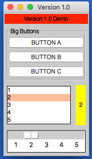
from appJar import gui

def press(btnName):
    app.popUp("INFO", "You pressed " + btnName)

def update(value):
    if value == "list": app.slider("slider", app.listbox(value)[0])
    elif value == "slider": app.listbox("list", app.slider(value))
    app.label("display", app.listbox("list")[0])

with gui("Version 1.0", bg="teal") as app:
    app.label("Version 1.0 Demo", colspan=2, bg="red")
    with app.labelFrame("Big Buttons", colspan=2, sticky="news", expand="both"):
        app.button("BUTTON A", press)
        app.button("BUTTON B", press)
        app.button("BUTTON C", press)
    app.listbox("list", [1, 2, 3, 4, 5], rows=5, selected=0, submit=update)
    app.label("display", "1", row=2, column=1, bg="yellow", sticky="news")
    app.slider("slider", colspan=2, range=(1,5), change=update, interval=1)
Operation
As demonstrated above, each widget now has a single function - the name of the widget.
Call this function passing one or both of the key parameters, to determine what should happen:
app.label("title", "text")      # ADD a label if the title is new
app.label("title", "text_2")    # SET a label if the title already exists
print(app.label("title"))       # GET a label if no widget is being added or set
Key Parameters
The two key parameters are:
| Parameter | Data type | Description |
|---|---|---|
| title | string | A unique identifier for that widget type. |
| value | string | Any relevant information for the widget. |
The logic is as follows:
- If
titledoesn't exist - ADD the widget, using thevalue, ortitleif novalueis specified. - If
titlealready exists and avalueis specified - SET the widget (either the values or state). - If
titlealready exists and avalueis not specified - GET the widget.
Positional Parameters
When adding a widget, it is positioned in the first column of a new row.
If you want to change this, you can specify where it should go, either by naming the paramters:
app.label("title", "text", row=2, column=4, rowspan=3) # ADD a label
Or by passing them as a tuple:
app.label("Main Title", pos=(1, 0))     # ADD a label in row 1, column 0
app.label("Sub Title", pos=(2, 0, 2))   # ADD a label in row 2, column 0, spanning 2 columns
| Parameter | Data type | Default | Description |
|---|---|---|---|
| row | integer | <next row> | The grid row to place the widget in. |
| column | integer | 0 | The grid column to place the widget in. |
| rowspan | integer | 1 | The number of grid rows to stretch the widget across. |
| colspan | integer | 1 | The number of grid columns to stretch the widget across. |
| pos | list/tuple | () | Position parameters for the widget, in the order: row, column, colspan, rowspan |
GUI Parameters
There are two GUI parameters which affect how widgets are displayed sticky and stretch.
These can be modified when adding a widget, just bear in mind they are GUI settings, and will affect all future widgets in the current container.
app.label("Title", sticky="", stretch="none")
app.label("SubTitle", sticky="ns", stretch="row")
| Parameter | Data type | Default | Description |
|---|---|---|---|
| sticky | string | <varies> | Describes which sides the widget will stick to, one or more of: n, e, w, s in a single string. |
| stretch | string | <varies> | Describes how the widget will stretch to fill the row/column: none, row, column or all. |
Event Parameters
Most of the widgets also have some support for events (see the events page for more information).
submit & change will pass the name of the widget to the function, drop will pass the data to the function:
NB. the parameter should only be the name of the function, don't include any brackets.
def update(name):
    if name == "size":
        updateSize()
    elif name == "toppings":
        updateToppings()

app.listbox("size", ["small", "medium", "large"], change=update)
app.listbox("toppings", ["corn", "cheese", "peppers"], change=update)
app.image("img1", "placeholder.gif", drop=True)
| Parameter | Data type | Default | Description |
|---|---|---|---|
| change | function | None | A function to call when the widget is changed. |
| callFunction | boolean | True | Set this to False, when setting the widget to stop the change function form being called. |
| submit | function | None | A function to call when the widget is submitted. |
| over | function (list) | None | A function to call when the mouse enters the widget, with an optional second function to call when the mouse leaves. |
| drop | boolean/function | None | Update the widget with dropped data if True, otherwise call the function. |
| drag | function (list) | None | A function to call call when the widget is dragged, with an optional second function to call when the widget is dropped. |
Other Parameters
There are some other parameter that can be set on widgets.
| Parameter | Data type | Default | Description |
|---|---|---|---|
| label | boolean/string | False | Adds a Label before the widget (only some input widgets), either the label's title or the the text of this parameter. |
| right | string | None | Specify a premade right-click menu to link to the widget. |
| font | integer/dict | None | Pass either a font size, or a dictionary of font properties to use for this widget's font. |
| focus | boolean | False | Give keyboard focus to the widget. |
| tip | string | None | Sets text to show in a mouse-over tooltip. |
Tree
Displays the tree widget.
.tree(title, value, **kwargs)Thevalueshould either by an XML string, or XMLDocumentobject
| Parameter | Data type | Default | Description |
|---|---|---|---|
| click | function | None | A function to call when a node is clicked. |
| dbl | function | None | A function to call when a node is double-clicked. |
| edit | function | None | A function to call when a node is edited. |
| editable | boolean | None | Determines if nodes are editable or not. |
| attributes | boolean | None | Determines if attributes should be shown in the tree. |
| fg | string | None | The foreground colour of the widget. |
| bg | string | None | The background colour of the widget. |
| fgH | string | None | The foreground colour of a selected node. |
| bgH | string | None | The background colour of a selected node. |