Bars & Popups
One of the features we are working towards in the 1.0 release, is a simplified way of adding, setting & getting widgets.
Each widget will have a single function that supports all three actions.
If you combine this with the context manager feature, this becomes possible:
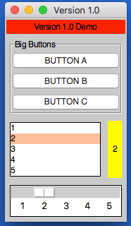
from appJar import gui

def press(btnName):
    app.popUp("INFO", "You pressed " + btnName)

def update(value):
    if value == "list": app.slider("slider", app.listbox(value)[0])
    elif value == "slider": app.listbox("list", app.slider(value))
    app.label("display", app.listbox("list")[0])

with gui("Version 1.0", bg="teal") as app:
    app.label("Version 1.0 Demo", colspan=2, bg="red")
    with app.labelFrame("Big Buttons", colspan=2, sticky="news", expand="both"):
        app.button("BUTTON A", press)
        app.button("BUTTON B", press)
        app.button("BUTTON C", press)
    app.listbox("list", [1, 2, 3, 4, 5], rows=5, selected=0, submit=update)
    app.label("display", "1", row=2, column=1, bg="yellow", sticky="news")
    app.slider("slider", colspan=2, range=(1,5), change=update, interval=1)
Operation
As demonstrated above, each widget now has a single function - the name of the widget.
Call this function passing one or both of the key parameters, to determine what should happen:
app.label("title", "text")      # ADD a label if the title is new
app.label("title", "text_2")    # SET a label if the title already exists
print(app.label("title"))       # GET a label if no widget is being added or set
Key Parameters
The two key parameters are:
| Parameter | Data type | Description |
|---|---|---|
| title | string | A unique identifier for that widget type. |
| value | string | Any relevant information for the widget. |
The logic is as follows:
- If
titledoesn't exist - ADD the widget, using thevalue, ortitleif novalueis specified. - If
titlealready exists and avalueis specified - SET the widget (either the values or state). - If
titlealready exists and avalueis not specified - GET the widget.
Positional Parameters
When adding a widget, it is positioned in the first column of a new row.
If you want to change this, you can specify where it should go, either by naming the paramters:
app.label("title", "text", row=2, column=4, rowspan=3) # ADD a label
Or by passing them as a tuple:
app.label("Main Title", pos=(1, 0))     # ADD a label in row 1, column 0
app.label("Sub Title", pos=(2, 0, 2))   # ADD a label in row 2, column 0, spanning 2 columns
| Parameter | Data type | Default | Description |
|---|---|---|---|
| row | integer | <next row> | The grid row to place the widget in. |
| column | integer | 0 | The grid column to place the widget in. |
| rowspan | integer | 1 | The number of grid rows to stretch the widget across. |
| colspan | integer | 1 | The number of grid columns to stretch the widget across. |
| pos | list/tuple | () | Position parameters for the widget, in the order: row, column, colspan, rowspan |
GUI Parameters
There are two GUI parameters which affect how widgets are displayed sticky and stretch.
These can be modified when adding a widget, just bear in mind they are GUI settings, and will affect all future widgets in the current container.
app.label("Title", sticky="", stretch="none")
app.label("SubTitle", sticky="ns", stretch="row")
| Parameter | Data type | Default | Description |
|---|---|---|---|
| sticky | string | <varies> | Describes which sides the widget will stick to, one or more of: n, e, w, s in a single string. |
| stretch | string | <varies> | Describes how the widget will stretch to fill the row/column: none, row, column or all. |
Event Parameters
Most of the widgets also have some support for events (see the events page for more information).
submit & change will pass the name of the widget to the function, drop will pass the data to the function:
NB. the parameter should only be the name of the function, don't include any brackets.
def update(name):
    if name == "size":
        updateSize()
    elif name == "toppings":
        updateToppings()

app.listbox("size", ["small", "medium", "large"], change=update)
app.listbox("toppings", ["corn", "cheese", "peppers"], change=update)
app.image("img1", "placeholder.gif", drop=True)
| Parameter | Data type | Default | Description |
|---|---|---|---|
| change | function | None | A function to call when the widget is changed. |
| callFunction | boolean | True | Set this to False, when setting the widget to stop the change function form being called. |
| submit | function | None | A function to call when the widget is submitted. |
| over | function (list) | None | A function to call when the mouse enters the widget, with an optional second function to call when the mouse leaves. |
| drop | boolean/function | None | Update the widget with dropped data if True, otherwise call the function. |
| drag | function (list) | None | A function to call call when the widget is dragged, with an optional second function to call when the widget is dropped. |
Other Parameters
There are some other parameter that can be set on widgets.
| Parameter | Data type | Default | Description |
|---|---|---|---|
| label | boolean/string | False | Adds a Label before the widget (only some input widgets), either the label's title or the the text of this parameter. |
| right | string | None | Specify a premade right-click menu to link to the widget. |
| font | integer/dict | None | Pass either a font size, or a dictionary of font properties to use for this widget's font. |
| focus | boolean | False | Give keyboard focus to the widget. |
| tip | string | None | Sets text to show in a mouse-over tooltip. |
PopUp
Displays a popUp.
.popUp(title, message=None, kind="info", parent=None)
This will show any of the available popUps.
titlewill be displayed in the title bar.messagewill be displayed as the text of the popUp.
If nomessageis set,messagewill be set totitleandtitlewill be set tokind
kinddefaults toinfo, but can be any of:error,warning,yesno,question,ok,retry,string,integer,float,textornumber.
parentallows you to link this popUp to a named SubWindow, instead of the main window.
Statusbar
-
.statusbar(**kwargs)
Functions to show or update a statusbar.
It will add a statusbar if none exists, with the following parameters:headerthis will set a piece of text to put before any messages.fieldsthis will set the number of fields to show in the statusbar.sidethis will set whether to show the fields on theLEFT,RIGHT, or the defaultstretched.texttext to put in the first field.
-
.statusbar(**kwargs)
Or, update the statusbar if one does exist:texttext to put in the field.fieldthe field numberis applicable.
Toolbar
Displays the toolbar.
.toolbar(names, funcs, **kwargs)namesshould be the list of button names to display on the toolbar.
funcsshould contain either a single function, that all buttons will be linked to, or a list of functions for each button.
| Parameter | Data type | Default | Description |
|---|---|---|---|
| icons | boolean/list | False | Determines if appJar should try to find icons for each menu item (True) or a list of icon names. |
| status | list | [] | The enabled status of each button (False to disable). |
| pinned | boolean | None | If set, the toolbar will be pinnable. Setting to True wil start pinned, False not pinned. |
| disabled | boolean | False | Determines if the toolbar should start disabed or not. |
| hidden | boolean | False | Determines if the toolbar should start hidden or not. When hidden it is completley removed from the GUI. |